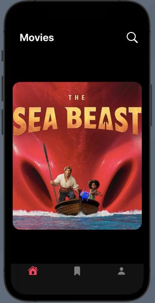
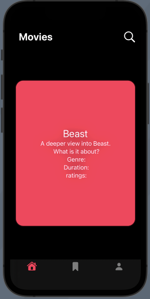
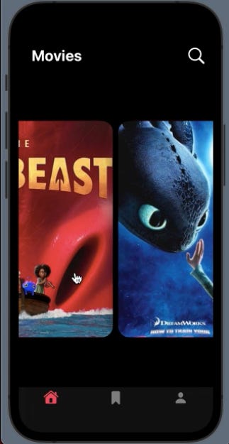
Carousel animation in Swiftui
Consider the dictionary below for our data:
var details = [
"Tom": "https://m.media-amazon.com/images/W/IMAGERENDERING_521856-T1/images/I/81sGVvD67eL._SY450_.jpg",
"Beast":"https://ntvb.tmsimg.com/assets/p21948923_v_h10_aa.jpg?w=960&h=540",
"Owl":"https://ih1.redbubble.net/image.2385686111.4230/poster,504x498,f8f8f8-pad,600x600,f8f8f8.jpg",
"Ducky":"https://eikhu9b6e94.exactdn.com/wp-content/uploads/2020/03/DuckTales-Poster.jpg?strip=all&lossy=0&quality=80&webp=80&avif=80&ssl=1",
"Panda": "https://encrypted-tbn0.gstatic.com/images?q=tbn:ANd9GcSGeOPlpwbIU82MVrzQL0vyS8u3Xvr17aPuiw&usqp=CAU",	"Dragon":"https://imgix.ranker.com/user_node_img/585/11694849/original/11694849-photo-u23?auto=format&q=60&fit=crop&fm=pjpg&dpr=2&w=375"
]
This dictionary includes a key representing the title and a corresponding value representing the URL of an image.
Step 1: Create the card view
struct CardView: View {
	var body: some View {
	  Rectangle()
	     .fill(Color.pink)
   	     .frame(height:400)
	     .cornerRadius(20)
	     .padding()
	     .shadow(color: .pink.opacity(0.5), radius: 2)
	}
}
Step 2: Create the front view of the card
struct CardFrontView: View {
	@State var image: String
	@Binding var degree : Double
    var body: some View {
	VStack {
	   AsyncImage(url: URL(string: image)) { phase in
	    if let image = phase.image {
	      image
		.resizable()
		.aspectRatio(contentMode: .fill)
		.frame(width: 350, height: 400)
	    } else {
              Image(systemName: "photo")
		.resizable()
		.aspectRatio(contentMode: .fill)
		.frame(width: 300, height: 300, alignment: .center)
            }
	 }
	   .cornerRadius(20)
	}
	.padding(20)
	.rotation3DEffect(Angle(degrees: degree), axis:(x:0,y:1,z:0))
   }//body
}//CardFrontView
Step 3: Create the reverse view of the card
struct CardBackView: View {
	@State var title: String
	@Binding var degree : Double
    var body: some View {
	VStack {
	  Text(title)
	    .font(.title)
	  Text("A deeper view into \(title). \n What is it about? \n Genre: \n Duration: \n ratings: ")
	    .font(.body)
	    .multilineTextAlignment(.center)
	}
	.rotation3DEffect(Angle(degrees: degree), axis:(x:0,y:1,z:0))
	.frame(width: 300, height: 300, alignment: .center)
   }//body
}//CardBackView
The .rotation3DEffect modifier is used to rotate a view in 3D space along a specified axis. The degree parameter specifies the angle of rotation in degrees, while the axis parameter specifies the axis around which the view is to be rotated. In our case, we are rotating along the y axis.
Step 4: Create the flip animation
@State var backDegree = 0.0
@State var frontDegree = -90.0
@State var isFlipped = false
let durationAndDelay : CGFloat = 0.3
func flipCard(){
    isFlipped = !isFlipped
    if isFlipped {
	withAnimation(.linear(duration: durationAndDelay)) {
	   backDegree = 90
        }
        withAnimation(.linear(duration:durationAndDelay)
             .delay(durationAndDelay)) {
		frontDegree = 0
	}
    } else {
        withAnimation(.linear(duration: durationAndDelay)) {
		frontDegree = -90
        }
        withAnimation(.linear(duration: durationAndDelay)
             .delay(durationAndDelay)){
		backDegree = 0
	}
    }
}//flipCard
Step 5: Stack both the front and back views together.
The front and back view of the card are displayed in a ZStack
struct FullCardView: View {
    @State var title: String
    @State var image: String
    var body: some View {
	ZStack {
	   CardFrontView(image: image, degree: $backDegree)
	   CardBackView(title: title, degree: $frontDegree)
	}
	.shadow(color: .black, radius: 16)
	.onTapGesture {
	    flipCard()
	}
    }//body
}//FullCardView
Step 6: Create the carousel view
struct ContentView: View {
    @State private var index = 0
     var body: some View {
       VStack {
	TabView(selection: $index) {
	   ForEach(details.sorted(by: <), id: \.key) { key, value in
		CardView()
		   .overlay(FullCardView(title: key, image: value))
	   }
	    .tabViewStyle(PageTabViewStyle(indexDisplayMode: .never))
       }
     }//body
Here we create a TabView that displays a collection of cards. The index variable is a state variable that keeps track of the currently selected tab.
The TabView displays a set of CardView objects, each of which is overlaid with a FullCardView that shows the full details of the card.
The details dictionary contains the key-value pairs of the titles and image URLs for each card.
The ForEach loop iterates over the sorted key-value pairs of details and creates a CardView object for each card.
The tabViewStyle modifier sets the style of the TabView to PageTabViewStyle, which displays the cards in a paged manner and hides the tab bar. The indexDisplayMode is set to .never to hide the index display of the TabView.
How does the flipCard function work?
The function has three variables named “backDegree”, “frontDegree”, and “isFlipped”.
When the function is called, it toggles the “isFlipped” variable and applies animation to change the “backDegree” and “frontDegree” values accordingly.
The back card’s angle starts at 0 and changes to 90, and the front of the card begins at -90 degrees and changes to 0.
To reverse the animation, the values are changed back to their start values.
The front and back views of the card are rotated around the y-axis to create a flip animation. By using .linear, the flip animation will be smooth and consistent without any abrupt changes (acceleration/deceleration) in speed. The delay modifier is used to delay the animation of the “frontDegree” variable by the same duration as the “backDegree”, so that the flip animation appears more realistic.